Gameplay observations come from the supplied footage. Store details and player feedback are identified separately.
Do color and shape help players distinguish safe routes from hazards as scenes change?
Color gives the course its first vocabulary
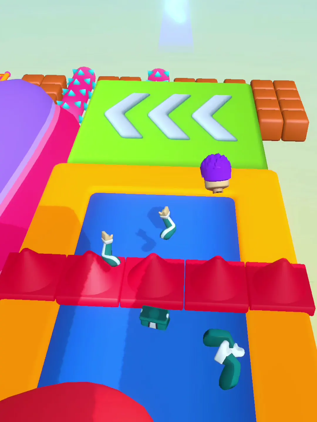
The opening platforms contrast turquoise, orange, red and yellow hexagons against a blue-green background. Later scenes introduce lime surfaces, cyan curves, orange chains and bright pink or yellow structures. This abundance makes each course feel energetic, and the major hazards—such as a red glove or hanging spiked balls—have silhouettes that stand apart from flat platforms.
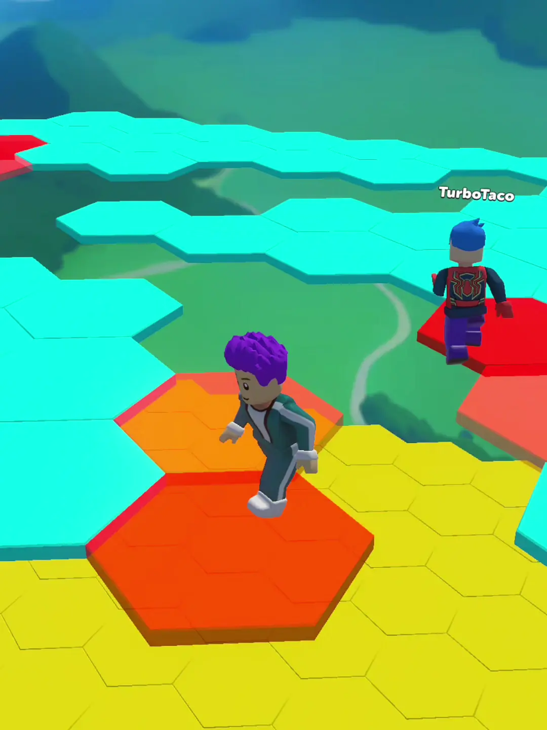
Gameplay footage · 00:13
A palette can guide, but it can also crowd
From a florist’s arrangement perspective, the strongest compositions group a few colors into a readable focal path. The later course often places many saturated props in one view. That can make the route feel playful, yet the captured frames do not always show a consistent color rule for “safe,” “moving,” or “dangerous.” The glove is recognizable by shape; color alone does not provide a reliable hazard code in the material reviewed.

Gameplay footage · 02:40
Identity is more than brightness
Across the supplied frames, the visual vocabulary is made from colored hex platforms, curved structures and toy-like obstacle props. The partial transition card is not fully legible. These are observations about the footage; the store page remains a separate title and listing reference, so its keyboard-themed marketing is not used to reinterpret the recorded art direction.
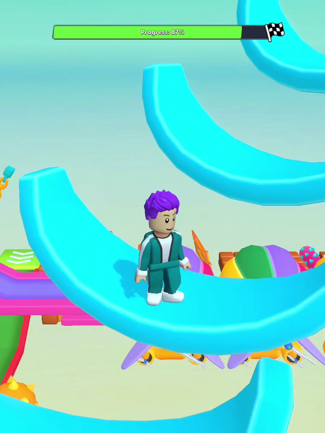
Gameplay footage · 04:23
Verdict
The footage has strong color contrast and recognizable prop shapes, which helps a viewer track the avatar. A more disciplined safety palette and less crowded framing could strengthen wayfinding. Still, this is a visual reading of one supplied recording, not a claim that the app has accessible color coding. This is not an accessibility test and does not claim anything about levels that are not shown.
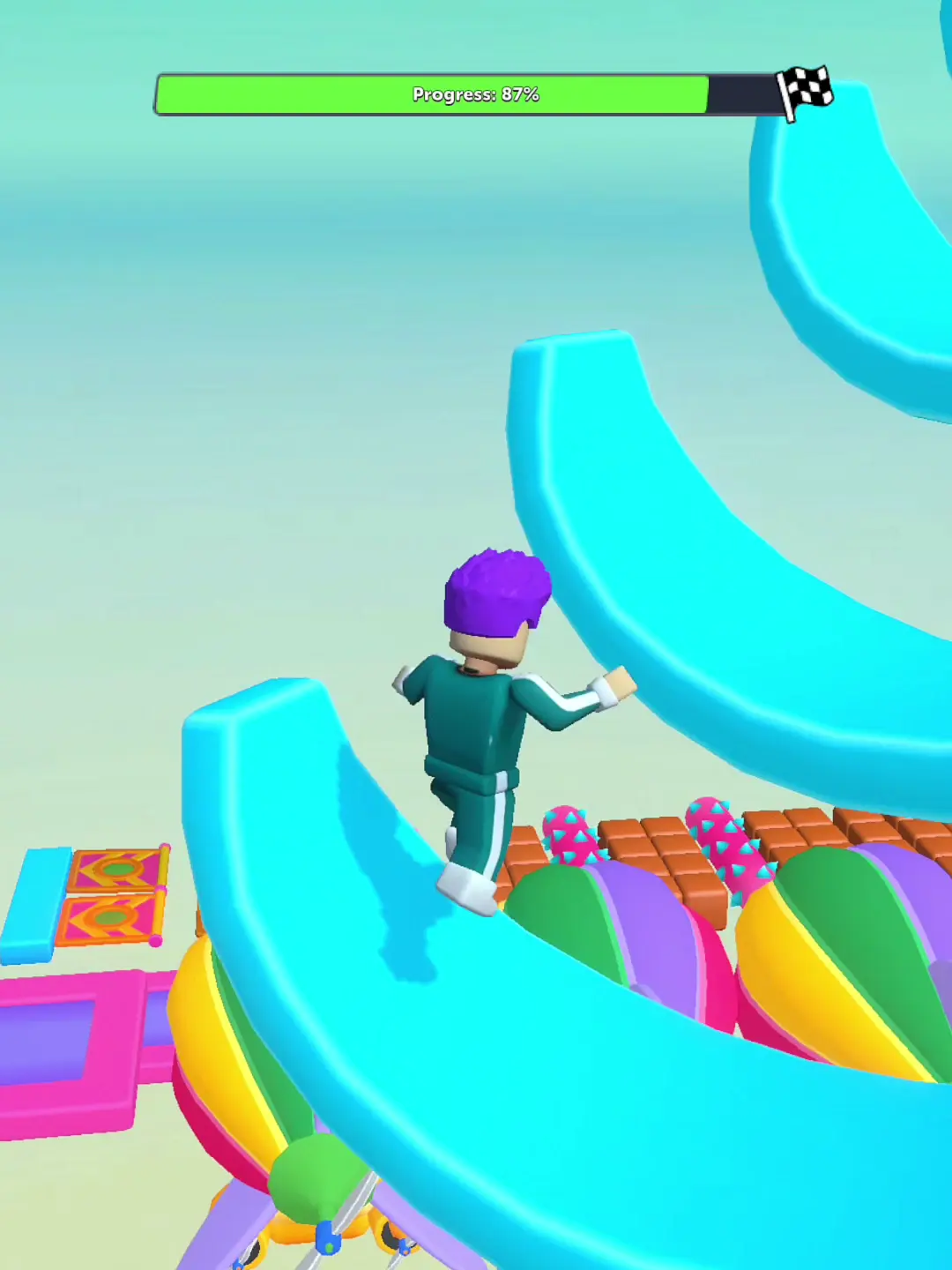
Gameplay footage · 05:01
What works
- High contrast separates many platforms from the sky and backdrop.
- Several hazards have distinctive, readable silhouettes.
What holds it back
- Saturated props can compete with the route for attention.
- No consistent color-to-rule mapping is established by the sampled frames.
A florist's lens: palette, grouping, and wayfinding
Zoe's perspective notices color relationships and has limited leisure time, while her disclosed bias is that a beautiful surface can win her over before depth is proven. The opening platform palette contrasts turquoise, orange, red and yellow against a blue-green backdrop; later frames add lime platforms, cyan structures and orange chains. The red glove and hanging balls have shapes that remain recognizable when the scene becomes busy. This gives the course visual energy, but it does not establish a reliable color code for safety, motion, or danger. A more consistent palette could reduce the work of distinguishing route from decoration, especially when several saturated props share one frame. That is a design inference from composition, not an accessibility certification or color-vision test. Because Zoe values practice, she can accept a route that asks for learning; the sampled poses do not show how many attempts that takes. The balanced verdict is about visual vocabulary: color and silhouette help identify objects, while the rule attached to each object remains a separate question.
What the footage cannot show
Sound, touch response, exact obstacle timing, device performance, progression rules and ad frequency remain unverified.
More from the course
Six moments from the supplied footage, selected to illustrate the points discussed above.
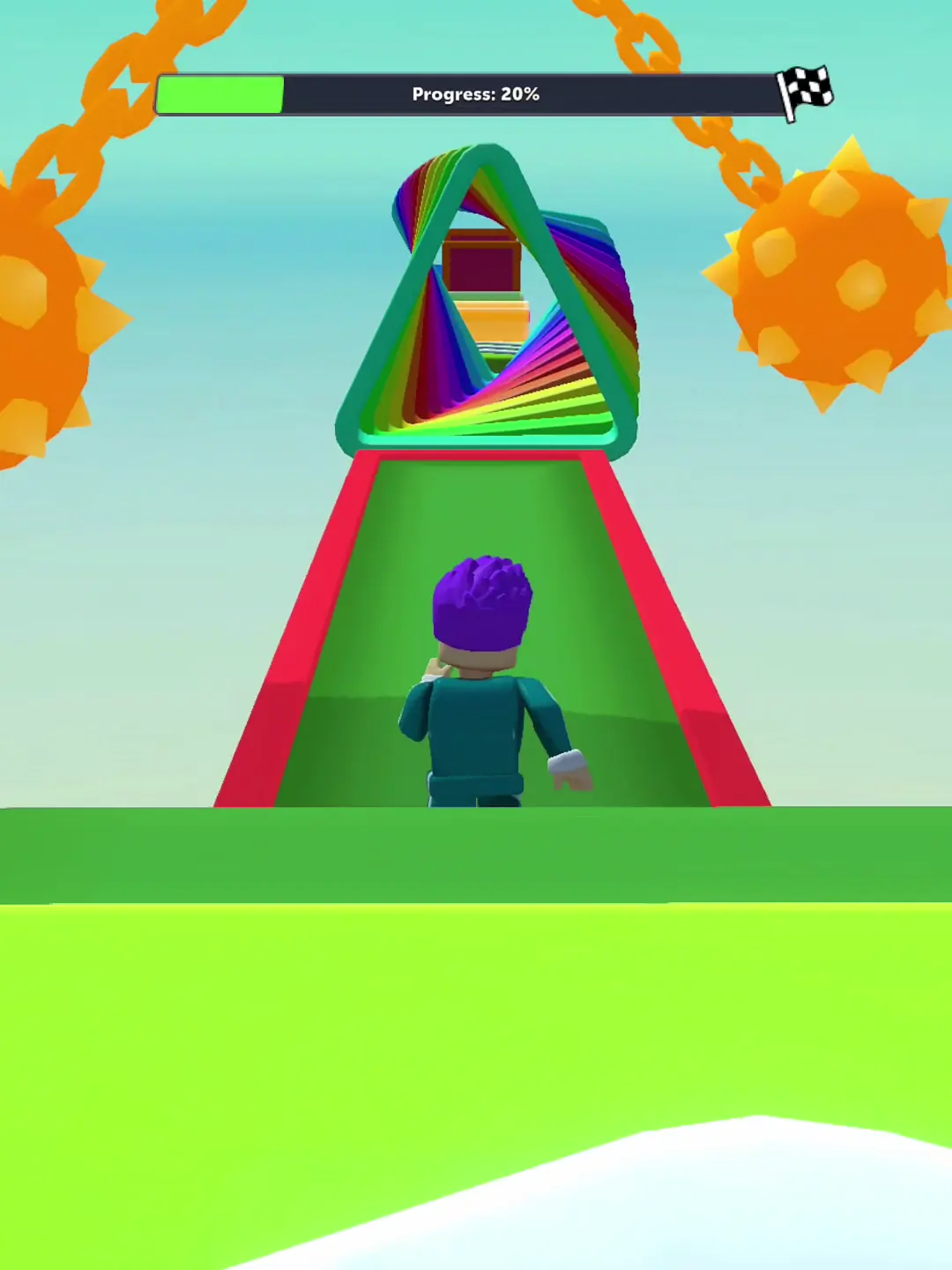
What players mention
Three reviews visible on the public Google Play listing showed mixed reactions. This small sample cannot represent the wider player base.
Official Google Play page / download ↗Gameplay videos
Watch the supplied Keyboard Escape playlist.